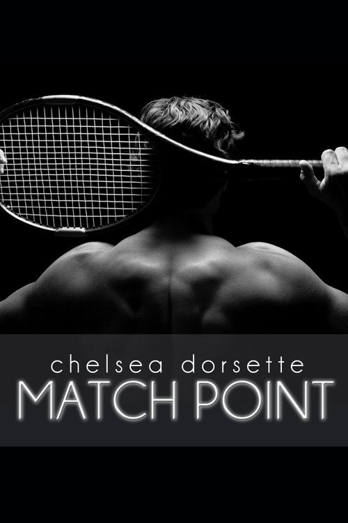
 I love black and white images. This cover doesn't have too much going on, which is good. Hot guy, not too risque or cliche with the pose. Tennis racket ties in well with the book title. Title and Author name clearly visible and easy to read. I read the blurb for this book and the title and cover fits perfectly with the description. I don't read erotica but this cover and blurb has me thinking about changing my mind.
Chelsea's Blog
This review was posted by blogger Amanda Meredith in a feature she did about good book covers vs bad ones. I am thrilled that Amanda chose Match Point as a cover that she thinks really hits the mark!
No comments:
Post a Comment